Lead UI Designer

TV Licensing Simple Payment Plan Portal

Product Design
UI Design
In development
Project Overview
TV Licensing needed a fresh new Simple Payment Plan portal, with UX/UI enhancements and new additional features to help customers onboard and manage their plan. There were 3 variations and user types needed for the portal; One for customers invited to the plan, one for field agents and one for call centre agents. We also had to take into consideration the vulnerable users who are in financial difficulties.
My Role
Lead UI designer in a more product focussed role for this project. Working closely with a lead UXer overseeing the project, project manager and our dev team. We were a partner of Cabot Financial who held the contract for fulfilling this scheme. Key stakeholders from Cabot Financial included a Product Owner, CIO and BAs. The main client was the BBC with whom we had various workshops and key milestone presentations on progress.
The brief
These were the requirements agreed for the design phase:
  • Onboarding workshop to immerse ourselves in the project & tender requirements
  • UX audit of existing onboarding and portal journeys (legacy system + suggested prototypes)
  • Up to 2 x stakeholders’ group workshops / interviews
  • User journey flow diagram for new
  • Onboarding and Portal flows, showing the branching logic based on user type
  • 3 x High-fidelity designed prototypes of the Onboarding and Portal
  • Presentation of the new product to stakeholders for sign-off
The project had a big focus on accessible design. The branding of the platform was requested to be generic enough to allow for an upcoming rebrand.
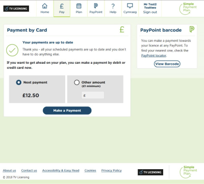
The current state
For context, these are the existing designs that we were briefed to improve.
Initial design steps
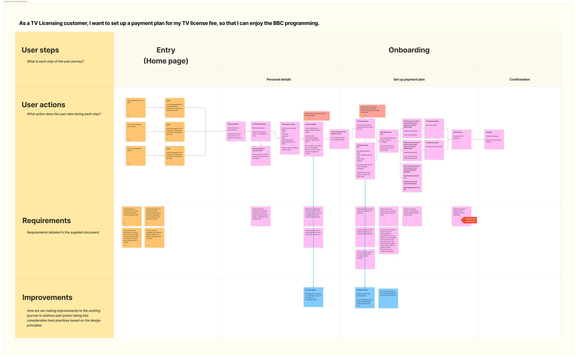
Following the defined requirements, I began the project by immersing myself in the current state. One of the main requirements of the project was that the portal needed to do everything the current one does along with the new additional features. To ensure the product achieved this, I mapped out the current user journeys of the existing product.

After this I mapped out improved cohesive user journeys to create the basis of the new designs.
Current state mapping
New user flow design
User Journey - Onboarding
User Journey - Managing plan
User Journey - Making a one-off payment
The solution
Following on from the initial design steps and immersion, I designed the screens moving through fidelity as we iterated and finalising on the high fidelity, dev ready designs meeting all requirements. Using a mini design system approach solely for this project, creating atomic elements, consistent components and variables that were all completely accessible, targeting WCAG 2.2 AAA where possible, but at a minimum meeting AA standards. Referencing BBC GEL (Global Experience Language) and the GOV.UK Design System.
Figma file organisation

Want to get in touch?
Drop me a line!

js-design@hotmail.co.uk
07866931209
Thank you! Your submission has been received!
Oops! Something went wrong while submitting the form.